介绍
CSS为样式表,后缀名.css
用于HTML文档中元素样式的定义
语法
CSS规则主要由两个主要部分构成:选择器、一条或多条声明(样式)
选择器通常是需要改变的HTML元素,每条声明由一个属性和一个值组成,由冒号隔开
可以在<header>标签中使用<style>标签来定义属性的样式,在属性后面添加大括号
选择器
全局选择器
与任何元素匹配,优先级最低,一般做初始化
元素选择器
该选择器选择的是页面上所有HTML元素的标签,描述一个标签的共性
比如可以使用<span>标签围起一段文字,添加选择器修改属性
类选择器
使用.<class>定义,针对所有该类名的标签使用
1
2
3
4
| <p class="content">1</p>
.content{
color:red;
}
|
- 类选择器可以被多种标签使用
- 类名不能以数字开头
- 同一个标签可以使用多个类选择器,空格隔开
ID选择器
针对某一个特定ID的标签使用,只能使用一次,用#定义
1
2
3
4
| <h2 id="title">hello</h2>
#title{
border:3px;
}
|
合并选择器
语法:选择器1,选择器2...{}
作用:提取共同样式
关系选择器
若E、F分别为两个选择器
后代选择器
后代选择器选择所有被E包含的F元素
语法:
e.g.
1
2
3
4
5
6
7
8
9
10
11
12
13
14
15
16
17
18
19
20
21
22
23
24
25
26
27
28
29
| <!DOCTYPE html>
<html lang="en">
<head>
<meta charset="UTF-8">
<meta name="viewport" content="width=device-width, initial-scale=1.0">
<title>Document</title>
<style>
ul li{
color: red;
}
</style>
</head>
<body>
<ul>
<li>a</li>
<li>a</li>
<li>a</li>
<div>
<ol>
<li>b</li>
</ol>
<p>c</p>
</div>
</ul>
</body>
</html>
|
子代选择器
子代选择器选择所有作为E元素的直接子元素F,对更深一层的不起作用
语法:
e.g.
1
2
3
4
5
6
7
8
9
10
11
12
13
14
15
16
17
18
19
20
21
22
23
24
25
| <!DOCTYPE html>
<html lang="en">
<head>
<meta charset="UTF-8">
<meta name="viewport" content="width=device-width, initial-scale=1.0">
<title>Document</title>
<style>
div>p{
color: red;
}
</style>
</head>
<body>
<div>
<p>hello</p>
<ul>
<li>
<p>hello2</p>
</li>
</ul>
</div>
</body>
</html>
|
相邻兄弟选择器
相邻兄弟选择器选择紧跟E元素后的F元素,选择相邻(向下选择)的一个兄弟元素
语法:
e.g.
1
2
3
4
5
6
7
8
9
10
11
12
13
14
15
16
17
18
19
20
| <!DOCTYPE html>
<html lang="en">
<head>
<meta charset="UTF-8">
<meta name="viewport" content="width=device-width, initial-scale=1.0">
<title>Document</title>
<style>
h1+p{
color: red;
}
</style>
</head>
<body>
<p>0</p>
<h1>2</h1>
<p>1</p>
<p>3</p>
</body>
</html>
|
通用兄弟选择器
选择E元素之后的所有兄弟元素F,选择相邻(向下选择)的所有兄弟元素
语法:
e.g.
1
2
3
4
5
6
7
8
9
10
11
12
13
14
15
16
17
18
19
20
| <!DOCTYPE html>
<html lang="en">
<head>
<meta charset="UTF-8">
<meta name="viewport" content="width=device-width, initial-scale=1.0">
<title>Document</title>
<style>
h1~p{
color: red;
}
</style>
</head>
<body>
<p>0</p>
<h1>2</h1>
<p>1</p>
<p>3</p>
</body>
</html>
|
优先级
CSS中权重用数字衡量
从高到低分别为:行内样式>ID选择器>类选择器>元素选择器
即越特殊选择器优先级越高
同级别下,按代码执行顺序自顶向下执行,下面的会把上面的覆盖
CSS引入方式
内联样式(行内样式)
在相关标签内使用style属性,该属性可以包含任何css属性
1
| <p style:"background: orange; font-size: 24px">css</p>
|
内部样式
当单个文档需要特殊样式时,建议使用内部样式,在<header>标签中使用<style>标签
1
2
3
4
5
6
7
8
9
10
11
12
13
14
15
16
| <!DOCTYPE html>
<html lang="en">
<head>
<meta charset="UTF-8">
<meta name="viewport" content="width=device-width, initial-scale=1.0">
<title>Document</title>
<style>p{
color: red;
font-size: 50px;
}</style>
</head>
<body>
<p>test</p>
</body>
</html>
|
若在多个页面中,内部样式就容易出现混乱
外部样式
当样式需要很多页面时,可以通过创建一个css文件来改变整个站点,每个页面使用<link>标签链接到样式表,在文档头部<header>
herf:链接到对应文件rel:当前文档与被链接文档的关系(缺省为stylesheet)
1
2
3
4
5
6
7
8
9
10
11
12
13
| <!DOCTYPE html>
<html lang="en">
<head>
<meta charset="UTF-8">
<meta name="viewport" content="width=device-width, initial-scale=1.0">
<title>Document</title>
<link rel="stylesheet" href="./public.css">
</head>
<body>
<p>test</p>
</body>
</html>
|
1
2
3
4
| p{
color:red;
font-size: 30px;
}
|
还可以导入css文件,这样可以使用导入的css文件中的选择器
语法:
1
2
3
| <style>
@import url("外部样式表名称")
</style>
|
- 导入样式表必须在
<style>标签内开头的位置定义,可以同时导入多种外部样式表
- url中的文件必须是全程,包含后缀名
字体属性
color
color可以规定文本的颜色,可以用名称、十六进制、rgb通道、rgba通道定义
1
2
3
4
5
6
| p{
color: red;
color: #ffffff;
color: rgb(0,0,0);
color: rgba(0,0,0,1);
}
|
font-size
设置文本大小
注意:chrome接受的最小字体是12px
font-weight
设置文本粗细
- bold:定义粗体字符
- bolder:定义更粗的字符
- lighter:定义更细的字符
- 100-900:定义指定粗细,其中400为默认,700为bold
1
2
| div{font-weight: bold;}
div{font-weight: 700;}
|
font-style
设置字体样式
font-family
指定一个元素的字体,每个值用逗号隔开
背景属性
background-color
设置背景颜色,可用值与字体颜色相同
1
2
3
| div{
background-color: red;
}
|
background-image
设置背景图像
元素背景是元素的总大小,包括填充与边界
默认放置在元素的左上角,若不够大则会在垂直和水平方向平铺图像,若过大则从图像左上角显示元素大小部分
1
2
3
| div{
background-image: url("图片链接");
}
|
background-repeat
设置如何平铺背景图像
repeat:默认值
repeat-x:只向水平方向平铺
repeat-y:只向垂直方向平铺
no-repeat:不平铺
1
2
3
4
| div{
background-image: url("图片链接");
background-repeat: no-repeat;
}
|
background-size
设置背景图像大小
- length:设置背景图片的宽高,第一个值为宽度,第二个值为高度,默认第二个值根据第一个自动设置
- percentage:设置相对位置区域的百分比,第一个值为宽度,第二个值为高度,默认第二个值根据第一个自动设置
- cover:保持纵横比并将图片缩放成完全覆盖背景区域的最小大小
- contain:保持纵横比并将图片缩放成适合背景定位区域的最大大小
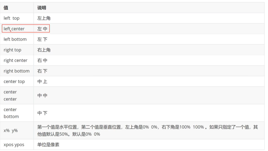
background-position
设置背景图像的起始位置,默认为0% 0%
文本属性
text-align
指定文本的水平对齐方式
- left:居左
- right:居右
- center:居中
text-decoration
指定文本修饰
- underline:下划线
- overline:上划线
- line-through:删除线
text-transform
控制文本大小写
- captialize:开头大写
- uppercase:全大写
- lowercase:全小写
text-indent
规定文本块中首行文本的缩进
允许负值,负值时将第一行左缩进
表格属性
表格边框
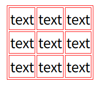
使用border属性添加表格边框
1
2
3
| table, td{
border: 1px solid red;
}
|
该效果为设置外边框与内边框
折叠边框
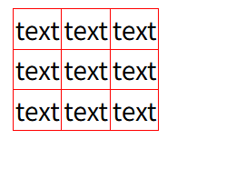
默认的边框是一种双边框
使用border-colllapse属性设置表格边框是否被折叠为一个单一的边框或隔开
1
2
3
4
| table{
border: 1px solid red;
border-collapse: collapse;
}
|
宽度与高度
使用width与height修改
文字对齐
- text-align:设置水平对齐方式,有left、right或center
- vertical-align:设置垂直对齐方式,有top、middle或bottom
表格填充
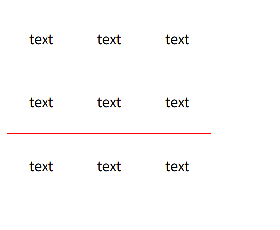
使用padding属性设置内部表格距离边界的大小
此时居中属性不起作用
1
2
3
4
5
6
7
8
9
10
| <style>
td,table{
border:1px solid red;
vertical-align: middle;
padding: 25px;
}
table{
border-collapse: collapse;
}
</style>
|
表格颜色
指定边框、文本和背景颜色
- 边框:在border中设置
- 背景:使用background-color设置
- 文本:使用color设置
盒子模型
固定盒子
可以认为所有HTML都可以看作盒子内的元素,CSS盒子模型本质上是一个盒子,封装周围的HTML元素,包括:外边距(margin),边框(boarder),内边距(padding),实际内容(content)
- margin:清除边框外的区域,外边距是透明的,参数一个时设定四周,参数两个时分别设置上下、左右边框
- border:围绕在内边距与内容的边框,参数包括大小、属性、颜色
- padding:清除内容周围的区域,根据内部元素样式决定显示样式,参数一个时设定四周,参数两个时分别设置上下、左右边框
- content:具体内容,显示文字与图像
其中边框可以使用-left, -right, -top, -bottom分别设置尺寸
1
2
3
4
5
6
7
8
9
10
11
12
13
14
15
16
17
18
19
20
21
22
23
24
25
26
27
28
29
30
31
32
| <!DOCTYPE html>
<html lang="en">
<head>
<meta charset="UTF-8">
<meta name="viewport" content="width=device-width, initial-scale=1.0">
<title>Document</title>
<style>
div{
height: 100px;
width: 100px;
background-color: red;
margin: 50px 10px;
border: 5px solid blue;
padding: 50px 10px;
}
</style>
</head>
<body>
<div>
content
</div>
<p>next content</p>
</body>
</html>
|
弹性盒子
弹性盒子由弹性容器与弹性子元素构成
通过设置display的值为flex来定义为弹性容器
弹性容器内包含一个或多个子元素
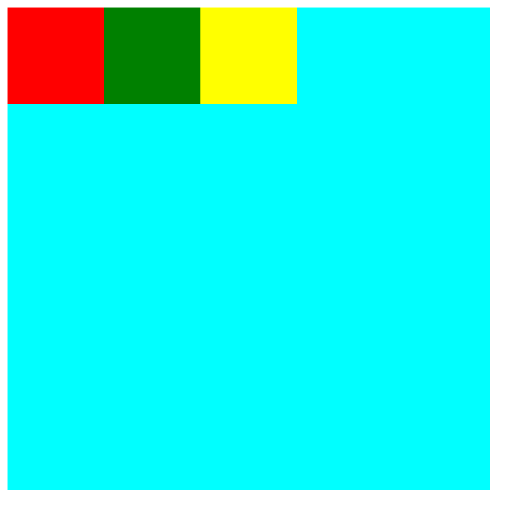
默认弹性盒子中的内容横向摆放
1
2
3
4
5
6
7
8
9
10
11
12
13
14
15
16
17
18
19
20
21
22
23
24
25
26
27
28
29
30
31
32
33
34
35
36
37
38
39
40
41
42
43
| <!DOCTYPE html>
<html lang="en">
<head>
<meta charset="UTF-8">
<meta name="viewport" content="width=device-width, initial-scale=1.0">
<title>Document</title>
<style>
.container{
width: 500px;
height: 500px;
background-color: aqua;
display: flex;
}
.box1{
width: 100px;
height: 100px;
background-color: red;
}
.box2{
width: 100px;
height: 100px;
background-color: green;
}
.box3{
width: 100px;
height: 100px;
background-color: yellow;
}
</style>
</head>
<body>
<div class="container">
<div class="box1"></div>
<div class="box2"></div>
<div class="box3"></div>
</div>
</body>
</html>
|
flex-direction
该属性制定了弹性子元素在父容器中的位置
语法:
1
| flex-direction: row|row-reverse|column|column-reverse
|
- row:横向从左到右排列,左对齐
- row-reverse:反转横向排列,从后往前排,最后一项排在最前面
- column:纵向排列
- column-reverse:反转纵向排列,从后往前排,最后一项排在最上面
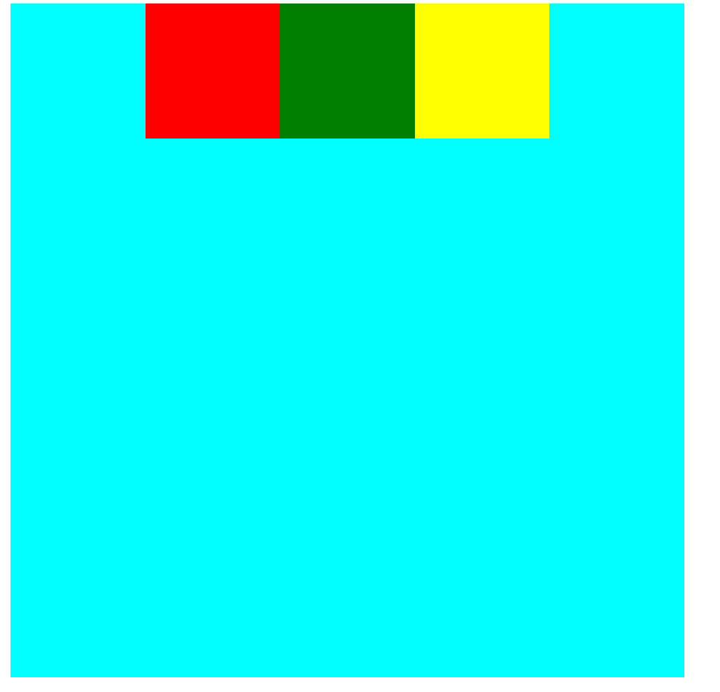
justify-content
内容对齐,把弹性项沿着弹性容器的主轴线对齐(垂直方向居中)
语法:
1
| justify-content: flex-start|flex-end|center
|
- 向行头紧挨着填充
- 向行尾紧挨着填充
- 居中紧挨着填充
1
2
3
4
5
6
7
8
| .container{
width: 500px;
height: 500px;
background-color: aqua;
display: flex;
justify-content: center;
}
|
align-items
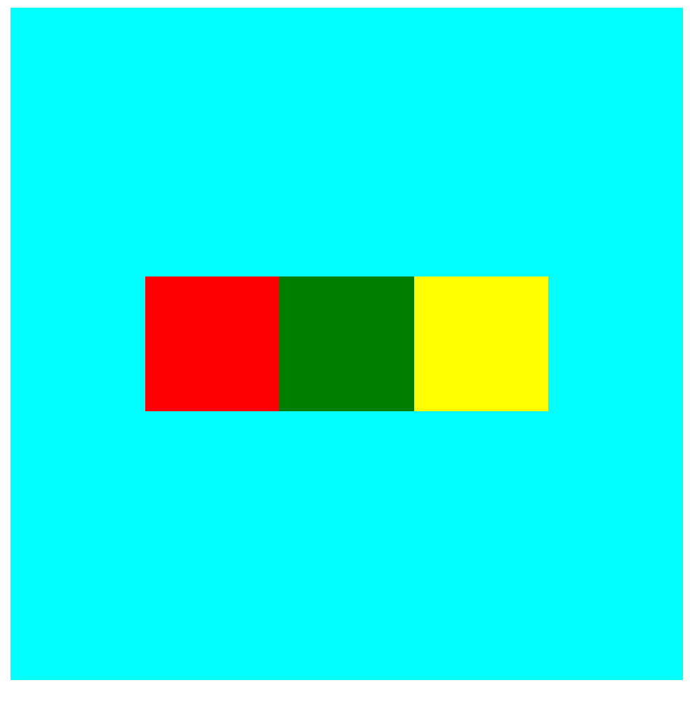
设置或检索弹性盒子元素在纵轴方向上的对齐方式(水平方向居中)
语法:
1
| align-items: flex-start|flex-end|center
|
- flex-start:元素的纵轴起始位置的边界紧靠该行侧轴起始边界
- flex-end:元素的纵轴起始位置的边界紧靠该行侧轴结束边界
- center:元素在该行的纵轴上居中放置,若尺寸小于弹性盒子元素尺寸,则会在两个方向溢出相同长度
1
2
3
4
5
6
7
8
9
| .container{
width: 500px;
height: 500px;
background-color: aqua;
display: flex;
justify-content: center;
align-items: center;
}
|
flex-grow
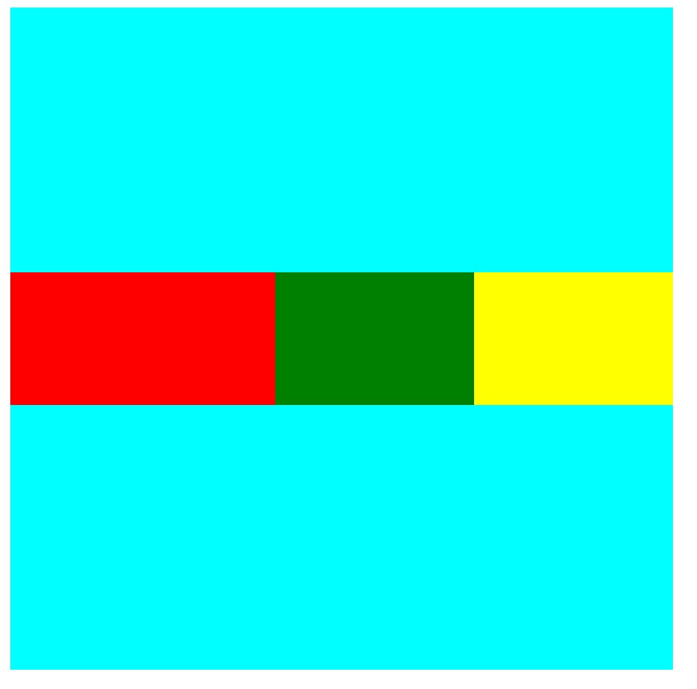
设置子元素,根据弹性盒子元素所设置的扩展因子作为比率来分配剩余空间
即设置对应子元素占用空间的权重
默认为0,优先级大于设定的宽高
若只有一个子元素设置,那么按扩展因子转化的百分比对其分配剩余空间
1
2
3
4
5
6
7
8
9
10
11
12
13
14
15
16
17
18
19
20
21
22
23
24
25
26
27
28
29
30
| .container{
width: 500px;
height: 500px;
background-color: aqua;
display: flex;
justify-content: center;
align-items: center;
}
.box1{
width: 100px;
height: 100px;
background-color: red;
flex-grow: 2;
}
.box2{
width: 100px;
height: 100px;
background-color: green;
flex-grow: 1;
}
.box3{
width: 100px;
height: 100px;
background-color: yellow;
flex-grow: 1;
}
|
浮动
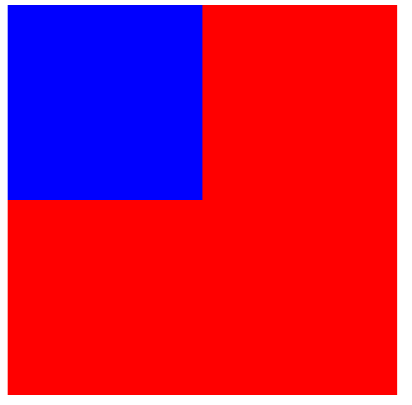
浮动使得元素脱离文档流
脱离文档流后,元素相当于在页面上增加一个浮层来放置内容
可以理解为两层页面,一层是底层的原页面,一层是脱离文档流的上层页面,会出现折叠现象
float属性包括left与right,设置向左或向右浮动,没有上下浮动
当容器不足横向摆放时,会自动放到下一行
向左/右浮动
1
2
3
4
5
6
7
8
9
10
11
12
13
| <style>
.box{
height: 200px;
width: 200px;
background-color: blue;
float: left;
}
.container{
height: 400px;
width: 400px;
background-color: red;
}
</style>
|
同时浮动
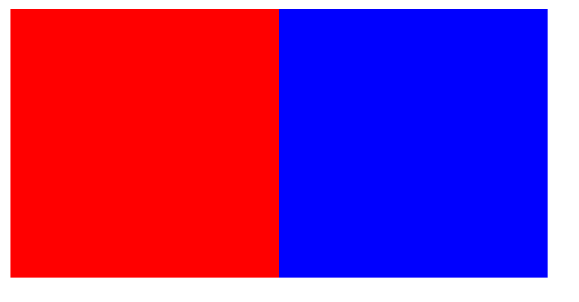
此时虽然是看似和普通左对齐一样,但是得到的元素是浮在内容层之上的
1
2
3
4
5
6
7
8
9
10
11
12
13
14
15
16
17
18
19
20
21
22
23
24
25
26
| <!DOCTYPE html>
<html lang="en">
<head>
<meta charset="UTF-8">
<meta name="viewport" content="width=device-width, initial-scale=1.0">
<title>Document</title>
<style>
div{
height: 200px;
width: 200px;
float: left;
}
.box1{
background-color: red;
}
.box2{
background-color: blue;
}
</style>
</head>
<body>
<div class="box1"></div>
<div class="box2"></div>
</body>
</html>
|
应用:设置导航栏
1
2
3
4
5
6
7
8
9
10
11
12
13
14
15
16
17
18
19
20
21
22
| <!DOCTYPE html>
<html lang="en">
<head>
<meta charset="UTF-8">
<meta name="viewport" content="width=device-width, initial-scale=1.0">
<title>Document</title>
<style>
ul li{
float: left;
margin: 0 30px;
}
</style>
</head>
<body>
<ul>
<li><a href="#">导航1</a></li>
<li><a href="#">导航2</a></li>
<li><a href="#">导航3</a></li>
<li><a href="#">导航4</a></li>
</ul>
</body>
</html>
|

清除浮动
浮动元素会产生一些问题:
1
2
3
4
5
6
7
8
9
10
11
12
13
14
15
16
17
18
19
20
21
22
23
24
25
26
27
28
29
30
31
32
33
34
35
36
| <!DOCTYPE html>
<html lang="en">
<head>
<meta charset="UTF-8">
<meta name="viewport" content="width=device-width, initial-scale=1.0">
<title>Document</title>
<style>
.box{
height: 100px;
width: 100px;
background-color: blue;
margin: 5px;
float: left;
}
.container{
height: 400px;
width: 400px;
background-color: red;
}
.text{
height: 100px;
width: 100px;
background-color: aqua;
}
</style>
</head>
<body>
<div class="container">
<div class="box"></div>
<div class="box"></div>
<div class="box"></div>
<div class="text"></div>
</div>
</body>
</html>
|
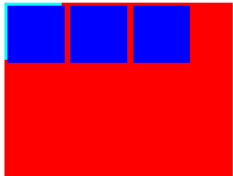
效果发现text被浮动元素遮挡
父元素设置高度
将父元素的自适应高度去掉,而是手动设置高度
但对于在父元素内的元素仍无法通过
1
2
3
4
5
6
7
| <div class="container">
<div class="box"></div>
<div class="box"></div>
<div class="box"></div>
<div class="text"></div>
</div>
|
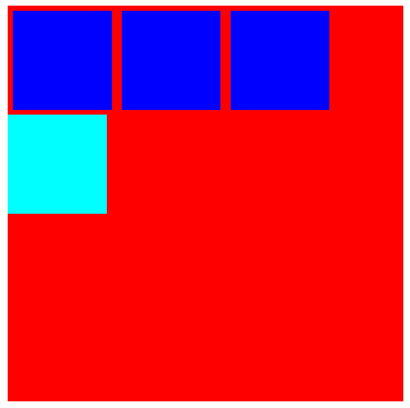
受影响的元素添加clear清除浮动
clear包含三个值:left、right与both,分别指清除左、右与两侧浮动
同级元素在父级元素内外都可
1
2
3
4
5
6
| .text{
height: 100px;
width: 100px;
background-color: aqua;
clear: both;
}
|
overflow清除浮动
若父级塌陷,且同级元素也受到影响,可以使用overflow清除
适用于父级布局不能设置高度,同级元素在父级元素外
1
2
3
4
5
6
7
8
9
10
11
12
13
14
15
16
17
18
| .container{
width: 400px;
background-color: red;
overflow: hidden;
clear: both;
}
<body>
<div class="container">
<div class="box"></div>
<div class="box"></div>
<div class="box"></div>
</div>
<div class="text"></div>
</body>
|
伪对象
若父级塌陷,且同级元素也受到影响,还可以使用伪对象
为父级元素添加伪类after
1
2
3
4
5
6
7
8
9
| .container{
width: 400px;
background-color: red;
}
.container::after{
content: "";
display: block;
clear: both;
}
|
定位
定义
position属性指定了元素的定位类型
- relative:相对定位
- absolute:绝对定位
- fixed:固定定位
其中绝对与固定定位会脱离文档流
设置定位以后,可以使用四个方向值调整位置left, top, right, bottom
相对定位
1
2
3
4
5
6
7
8
9
10
| <style>
div{
width: 200px;
height: 200px;
background-color: red;
position: relative;
left: 200px;
}
</style>
|
可以让元素距离左侧200px
绝对定位
1
2
3
4
5
6
7
8
9
10
11
12
13
14
15
16
| <style>
.box1{
width: 200px;
height: 200px;
background-color: red;
position: absolute;
left: 200px;
top: 100px;
}
.box2{
width: 300px;
height: 300px;
background-color: blue;
}
</style>
|
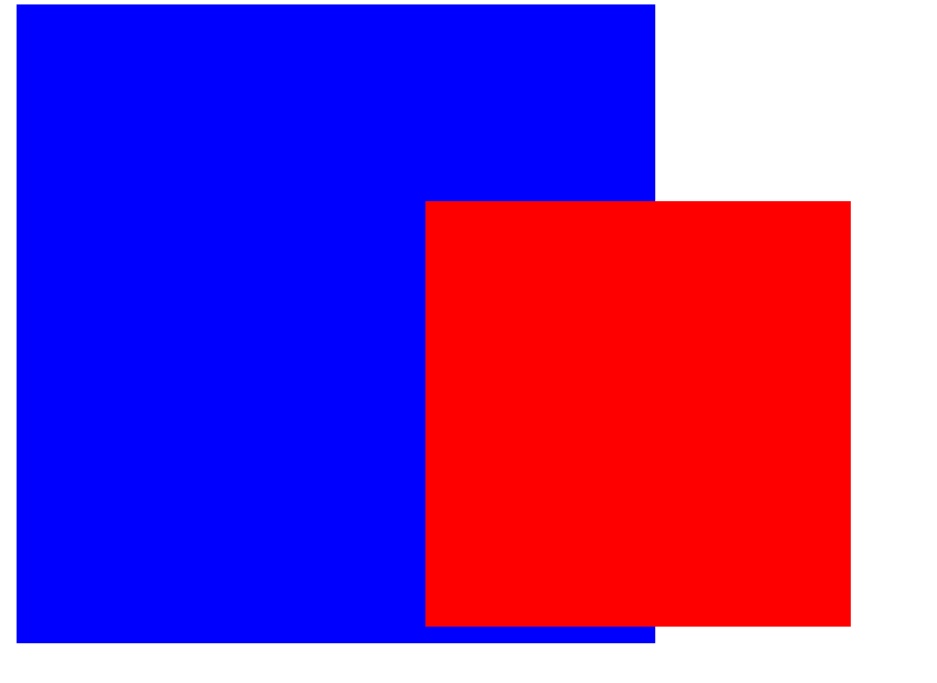
可以发现absolute是脱离文档流的
注意:每一个absolute定位都独占一层
固定定位
1
2
3
4
5
6
7
8
9
10
11
12
13
14
15
16
17
18
19
20
21
22
23
24
25
26
27
| <head>
<meta charset="UTF-8">
<meta name="viewport" content="width=device-width, initial-scale=1.0">
<title>Document</title>
<style>
.box1{
width: 200px;
height: 200px;
background-color: red;
position: fixed;
left: 200px;
top: 100px;
}
.box2{
width: 300px;
height: 300px;
background-color: blue;
}
</style>
</head>
<body>
<div class="box1"></div>
<div class="box2"></div>
</body>
|
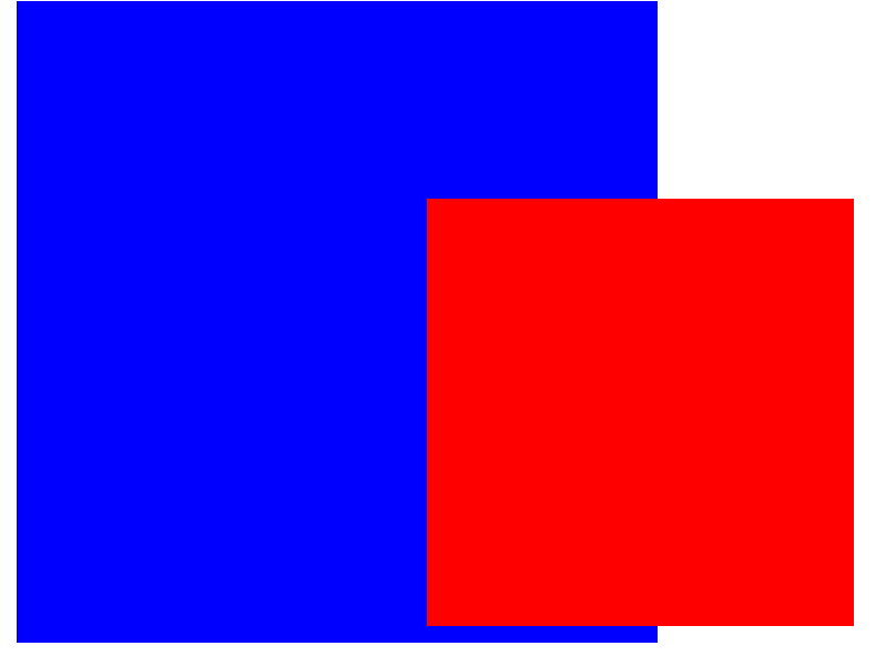
可以发现固定定位也是脱离文档流的
固定定位与绝对定位的不同之处在于,固定定位不会随着页面滚动而改变位置,一般一页只设置一个
定位原理
相对与绝对定位是根据具有定位的父级元素来设置的,若父级元素定位无定位则会一直追溯到文档顶端
1
2
3
4
5
6
7
8
9
10
11
12
13
14
15
16
17
18
19
20
21
22
23
24
25
26
27
28
29
30
31
32
| <head>
<meta charset="UTF-8">
<meta name="viewport" content="width=device-width, initial-scale=1.0">
<title>Document</title>
<style>
.container{
width: 300px;
height: 300px;
background-color: blue;
position: relative;
margin-left: 100px;
}
.box1{
width: 200px;
height: 200px;
background-color: red;
position: absolute;
left: 50px;
top: 50px;
}
</style>
</head>
<body>
<div class="container">
<div class="box1"></div>
</div>
</body>
|
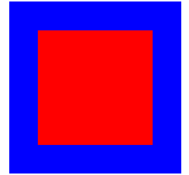
如该情况下,父级是relative,则box1是根据父级元素的位置来设置位置的
z-index
这个属性可以设置元素覆盖顺序先后,值越大优先级越大
1
2
3
4
5
6
7
8
9
10
11
12
13
14
15
16
17
18
19
20
21
22
23
24
25
26
27
28
29
30
31
32
| <!DOCTYPE html>
<html lang="en">
<head>
<meta charset="UTF-8">
<meta name="viewport" content="width=device-width, initial-scale=1.0">
<title>Document</title>
<style>
.box1{
width: 200px;
height: 200px;
background-color: blue;
position: absolute;
z-index: 100;
}
.box2{
width: 200px;
height: 200px;
background-color: red;
position: absolute;
left: 50px;
top: 100px;
z-index: 50;
}
</style>
</head>
<body>
<div class="box1"></div>
<div class="box2"></div>
</body>
</html>
|
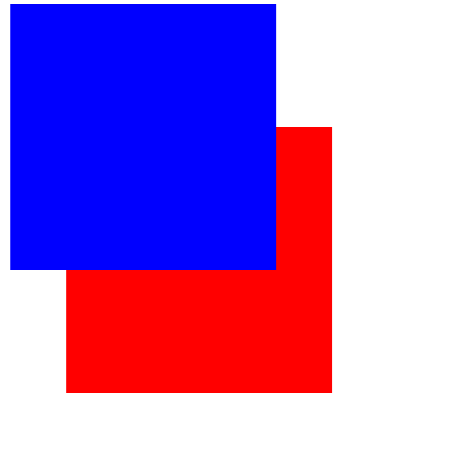
可以发现虽然代码中是box1在前,但实际显示box2在box1的上面
圆角与阴影
圆角
使用border-radius属性可以设置圆角,规则如下:
- 四个值:左上角、右上角、右下角、左下角
- 三个值:左上角、右上与左下角、右下角
- 两个值:左上与右下角、右上与左下角
- 一个值:四个圆角值相同
1
2
3
4
5
6
| div{
height: 100px;
width: 100px;
background-color: blue;
border-radius: 10px;
}
|
阴影
box-shadow属性向框添加一个或多个阴影
- h-shadow:水平阴影位置
- v-shadow:垂直阴影位置
- blur:模糊距离(可选)
- color:阴影颜色(可选)
1
2
3
4
5
6
7
8
9
10
11
12
13
14
15
16
17
18
19
20
21
| <!DOCTYPE html>
<html lang="en">
<head>
<meta charset="UTF-8">
<meta name="viewport" content="width=device-width, initial-scale=1.0">
<title>Document</title>
<style>
.box{
width:300px;
height:300px;
background-color: red;
margin: 0 auto;
box-shadow: 0 0 20px rgba(0,0,0,0.8);
}
</style>
</head>
<body>
<div class="box"></div>
</body>
</html>
|
动画
CSS中的动画是一种样式逐渐变为另一种的效果
使用百分比或from to规定变化时间,0%是开始,100%是完成
@keyframes
使用@keyframes规则创建动画
- name:动画名称
- percent:百分比值,可以添加多个
1
2
3
4
5
6
7
8
9
10
11
| @keyframe name{
from/0%{
}
percent{
}
to/100%{
}
}
|
动画执行
1
| animation: name duration timing-function delay iteration-count direction;
|
- name:设置动画名称
- duration:设置动画持续时间
- timing-function:设置动画效果速率
- ease:逐渐变慢(默认)
- linear:匀速
- ease-in:加速
- ease-out:减速
- ease-in-out:先加速后减速
- delay:设置动画开始时间(延时执行)
- iteration-count:设置动画循环次数,infinite为无限次数循环
- direction:设置动画播放方向
- normal:向前播放(默认)
- alternate:偶数次向前播放,奇数次反方向播放
- animation-play-state:控制动画播放时间
而且需要设置触发方式,这里可以使用hover属性设置鼠标悬停控制动画
鼠标放到色块上就停止播放
1
2
3
4
5
6
7
8
9
10
11
12
13
14
15
16
17
18
19
20
21
22
23
24
25
26
27
28
29
30
31
32
33
| <!DOCTYPE html>
<html lang="en">
<head>
<meta charset="UTF-8">
<meta name="viewport" content="width=device-width, initial-scale=1.0">
<title>Document</title>
<style>
div{
height:200px;
width:200px;
background-color: red;
animation: anime 3s linear 0s infinite;
}
div:hover{
animation-play-state: paused;
}
@keyframes anime{
0%{
background-color: red;
}
50%{
background-color: green;
}
100%{
background-color: red;
}
}
</style>
</head>
<body>
<div></div>
</body>
</html>
|
媒体查询
媒体查询会根据设备大小自动识别加载不同的样式
在head中添加meta标签可以防止不同设备中导致的缩放
1
| <meta name="viewport" content="width=device-width, initial-scale=1.0, maximum-scale=1, user-scalable=no">
|
width:宽度设置
initial-scale:初始缩放比例(默认1.0)
maximum-scale:允许用户缩放到的最大比例(默认1.0)
user-scalable:用户是否可以手动缩放(默认no)
使用
1
2
3
4
5
6
7
8
9
10
11
12
13
14
15
16
17
18
19
20
21
22
23
24
25
| <style>
.box{
width:300px;
height: 300px;
background-color: red;
}
@media screen and (max-width: 768px){
.box{
background-color: aqua;
}
}
@media screen and (max-width: 768px) and (max-width: 996px){
.box{
background-color: green;
}
}
@media screen and (max-width: 996px) {
.box{
background-color: red;
}
}
</style>
|
可以根据在不同设备的尺寸设置相应的样式
雪碧图
CSS
Sprite又称CSS精灵图/雪碧图,是一种网页图片应用处理方式,允许将一个页面涉及到的所有零星图片都包含到一张大图中
原理
- 通过background-image引入图片
- 通过background-position把图片移动到自己需要的位置
代码
1
2
3
4
5
6
7
8
9
10
11
12
13
14
15
16
17
18
19
20
| <style>
.icon1{
display: block;
width: 45px;
height: 70px;
background-image: url(1.png);
border: 1px solid red;
background-position: -20px -12px;
}
.icon2{
display: block;
width: 45px;
height: 70px;
background-image: url(1.png);
border: 1px solid red;
background-position: -300px -84px;
}
</style>
|
字体图标
设计时经常用到一些图标,但使用时往往会失真或减慢加载,所以可以使用字体图标的方式来显示图标
使用
选择需要的图标库,选择需要的图标,下载代码选择font-class引用
使用时在head标签内添加
1
| <link rel="stylesheet" href="url">
|
在body中按照文档调用
伪类/伪元素
伪类指定所选元素的特定状态,由冒号后跟着伪类名称组成,伪类所依附的元素被定义为锚元素
伪元素是一个附加在选择器末的关键字,允许对被选择元素的特定部分修改样式,由双冒号后跟着伪类名称组成,伪元素内至少要包含一个content样式,指定内容,不想要内容可以设为空字符串
伪类可以链式拼接,伪元素不可以,但伪元素可以依附于链式伪类最后
常用伪类
:active:鼠标按下不放:focus:元素获得焦点:first-child:第一个子元素:last-child:最后一个子元素:nth-child(n):特定位置子元素,n代表行数,可以直接带入计算,也可以传入odd代表奇数行,even代表偶数行:not():不匹配指定元素,括号内可以是某个元素、类或者其他指定元素
常用伪元素
::before:在元素前插入虚拟元素::after:在元素后插入虚拟元素::first-line:第一行文本::first-letter:第一个字符::selection:鼠标选中的文本